 I am describing building up the walls and image background now, but I actually didn't do this step until later when I actually created the image. I originally wanted a darker dungeon look as described in the book and the movie, but as I experimented with different background images, I liked how the castle walls ended up looking, so I went with that. The upper left corner elements of the Glastonbury layer were removed and feathered as decribed above leaving a hole into which additional background could be placed. I created a rectangular selection of the the stone wall in Conwy Castle and removed the rest of it.
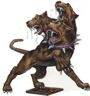
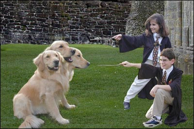
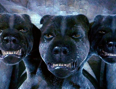 The final image doesn't really have Fluffy staring down (with all 6 of his eyes) Harry and Hermione. I took a little theatrical liberty and have all the characters facing us, the audience in a 3/4 view so we can see their cute faces. I did use the 3rd head (taked from Mac1 layer) in profile so make it look at if Samantha's wand was spellbinding him.
Do a rough selection around the head in the Mac1 and Mac3 layers. Invert the selection and delete the backgound. Don't worry about excess background now, we'll want to reposition and rotate the heads before masking so that when we rotate the layer, we don't lose the crispness of the masking. You can rotate/skew/distort individual layers under the Edit->Transform menu. Note the difference with this function and Image->Rotate which rotates the entire canvas and all layers equally. To create Fluffy, I made great use of the Edit->Transform functions. I flipped Mac2 and Mac3 horizonatally so he was facing the kids. I rotated the Mac1 head down about 60 degrees so he would end up looking down at Samantha's wand. I then positioned the heads in positions I liked, and did the cleanup work on the layers. Here's an early version:
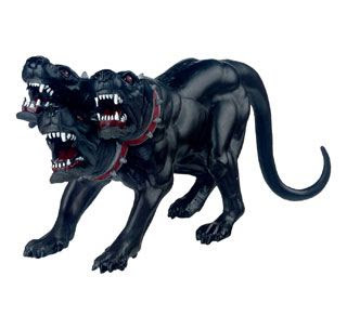
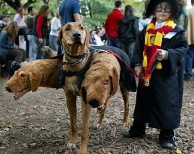 The only problem now is that the 3 headed monster dog is about the same size as the kids! Not too fierce yet, is he? He needs to be giant. I could scale the dog layers up a bit - Photoshop can do a decent job without too much image degradation. I try that but it ends up looking too pixelated after all. So on to the next best thing - I save a copy of the file, open it and scale the whole image down (using Image->Image Size) by about 20 percent. I then reopen the original file and bring in the now "giant" dog layers. This technique is only a good idea if you have a high enough resolution file to begin with. As I decrease the image size, I forfeit the ability to print out (if that is my intent) a larger, better quality image. Since this is for the web and some 4x6 holiday cards we'll be printing, my scaled down image size will still look good.
No comments:
Post a Comment